
To build this example we’ll need to add a few images to the img directory. Download and extract the following files and place them in the appropriate directory. Demo Images
Before we start we need to get an idea of the different components available to us. Based on the site sample we viewed earlier we can identify four key areas that we’ll need to build.
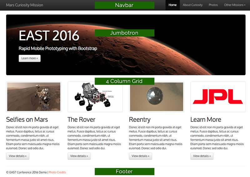
Navbar
The Navbar is a self-contained element that can be positioned at the top or the bottom of a page or element. Below is the code well need to implement a Navbar similar to what we have in the mock up. Copy an paste this code directly after the opening body tag. If you would like to customize its appearance, look at the documentation for your options.
After you have added the code, save the document and then Preview in your web Browser (F12 or File > Preview in Browser).
Content Container
The Content Container is a structural element required by Bootstrap to maintain document dimensions. We’ll add one to our code below the close of the Navbar section. Be sure to place the other components inside of this container element.
After you have added the code, save the document and then Preview in your web Browser (F12 or File > Preview in Browser).
Jumbotron Element
A Jumbotron Element is meant to be used as a call to action or a spot to feature a piece of content. The code we’ll use is below.
After you have added the code, save the document and then Preview in your web Browser (F12 or File > Preview in Browser).
4 Column Grid ( 2 Column Small Screen / 1 Column XS Screen)
In order to add a row of grid columns we’ll need to add a div with the class="row" attribute added. Inside we can place up to 12 additional “columns” using the appropriate Bootstrap classes. For example we’d like 4 equal-sized columns in our desktop mock up so we will add the class “col-md-3”. This class creates a column that spans 3 of the 12 available columns in the grid on any viewport greater than or equal to 992px. The second class “col-sm-6”, creates a column that spans 6 of the 12 available columns in the grid on any viewport sized between 769px and 991px. When the viewport is equal to or below 768px each column will span all grid columns. There are 4 different classed that allow you to target different breakpoints. For more information visit the documentation.
<div class="row">
    <div class="col-sm-6 col-md-3">COLUMN</div>
    <div class="col-sm-6 col-md-3">COLUMN</div>
    <div class="col-sm-6 col-md-3">COLUMN</div>
    <div class="col-sm-6 col-md-3">COLUMN</div>
</div>
To duplicate the demo site we’ll need to use the following code…

Selfies on Mars
Donec id elit non mi porta gravida at eget metus. Fusce dapibus, tellus ac cursus commodo, tortor mauris condimentum nibh, ut fermentum massa justo sit amet risus. Etiam porta sem malesuada magna mollis euismod. Donec sed odio dui.

The Rover
Donec id elit non mi porta gravida at eget metus. Fusce dapibus, tellus ac cursus commodo, tortor mauris condimentum nibh, ut fermentum massa justo sit amet risus. Etiam porta sem malesuada magna mollis euismod. Donec sed odio dui.

Reentry
Donec id elit non mi porta gravida at eget metus. Fusce dapibus, tellus ac cursus commodo, tortor mauris condimentum nibh, ut fermentum massa justo sit amet risus. Etiam porta sem malesuada magna mollis euismod. Donec sed odio dui.

Learn More
Donec id elit non mi porta gravida at eget metus. Fusce dapibus, tellus ac cursus commodo, tortor mauris condimentum nibh, ut fermentum massa justo sit amet risus. Etiam porta sem malesuada magna mollis euismod. Donec sed odio dui.
After you have added the code, save the document and then Preview in your web Browser (F12 or File > Preview in Browser).
Footer
And the last little bit of code we’ll need to finish off the design is really just a bit of html5 that declares a footer for the document. Add this code inside the container element we created a few steps back.
At this point you should have something that is starting to resemble this document. We are getting close but we can do better. Let’s take a look at customizing this to look closer to our mock up. View the next Module: Adding Custom CSS to a Bootstrap Mockup