As we move forward with our web design project, it is important that we take a look at the four main elements of a web site. They are Structure, Content, Design, Behavior. All four of these elements are equally important and will be the foundation for the remainder of this project.
Structure
Web site structure is the hierarchy of pages within your site. Once you have outlined what content will be included in the site, you can begin the process of building a structure for this content. A good visual tool for laying out the site structure is the storyboard. A storyboard is a small sketch that represents every page in the Web site. The storyboard shows the relationship of each page in the web site to all of the other pages. The example below shows the storyboard for this site.
Example
You will notice that the home page (default.asp) sits at the top of the hierarchy with all of the main pages sitting on the level below. The homepage is also called the parent page and the pages below it are known as child pages.
Content
The second element of a web site is content. Content is the entire collection of information included on your site. Content can be text, images, charts, graphs, surveys, news etc.
There is a saying in the web design community “Content Is King” and it couldn’t be more true. Without good content on your web site, what’s the point? If your content is not useful no one will use it. Site visitors might come once, but they will not return. While putting together your content in the next few days be sure and keep this in mind.
Design (Presentation)
The third element of a web site, design, is the way we choose to present the content we have collected. While planning your design consider the following elements of design:
- Color Scheme (Good Contrast, Readable)
- Font’s (Serif vs. San Serif)
- Graphics and Imagery (Meaningful, Non-distracting, Consistent)
- Layout ( Positioning of Elements on the Page)
Behavior
When building any web site, special attention needs to be paid how you intend the user to interact with the site. Key to this interaction is how elements present themselves to users. Behavior has do to with how web designers affect the interactive experience of their site programmatically. When a web designer decides there is a need to change the default behavior of an element within the site, most often times they will use the client-side scripting language JavaScript. Some examples of Javascript controlling behavior can be seen on this page. The drop down navigation across of the top the page is controlled by JavaScript as is the image zoom effect you see when clicking on the storyboard image above.
Whenever we alter the the default behavior of an element in our site we need to take into consideration the following things…
- Is the change counter-intuitive to what user expects to happen?
- Does the change degrade gracefully or in other words, does the page still work if the user has disabled JavaScript in their web browser?
User Experience (UX)
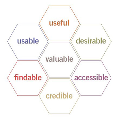
As we move forward this semester I would like of you all to think of the four areas discussed here as a means to enhance the User Experience of any site you create. One particularly useful model I have found for conceptualizing User Experience comes from Peter Morville. He disects User Experience into seven categories represented below in his User Experience Honeycomb.
- Useful. As practitioners, we can’t be content to paint within the lines drawn by managers. We must have the courage and creativity to ask whether our products and systems are useful, and to apply our deep knowledge of craft and medium to define innovative solutions that are more useful.
- Usable. Ease of use remains vital, and yet the interface-centered methods and perspectives of human-computer interaction do not address all dimensions of web design. In short, usability is necessary but not sufficient.
- Desirable. Our quest for efficiency must be tempered by an appreciation for the power and value of image, identity, brand, and other elements of emotional design.
- Findable. We must strive to design navigable web sites and locatable objects, so users can find what they need.
- Accessible. Just as our buildings have elevators and ramps, our web sites should be accessible to people with disabilities (more than 10% of the population). Today, it’s good business and the ethical thing to do. Eventually, it will become the law.
- Credible. Thanks to the Web Credibility Project, we’re beginning to understand the design elements that influence whether users trust and believe what we tell them.
- Valuable. Our sites must deliver value to our sponsors. For non-profits, the user experience must advance the mission. With for-profits, it must contribute to the bottom line and improve customer satisfaction.
Source: http://semanticstudios.com/publications/semantics/000029.php


